


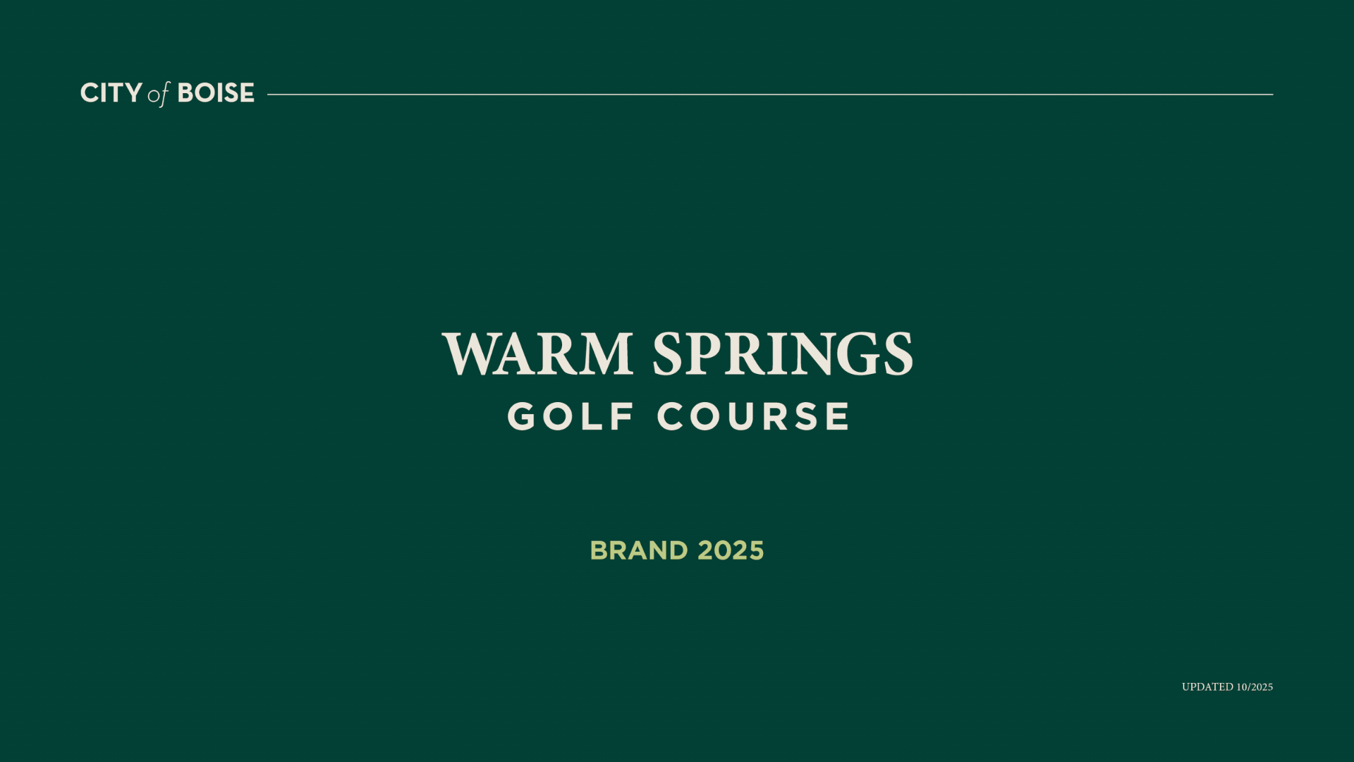
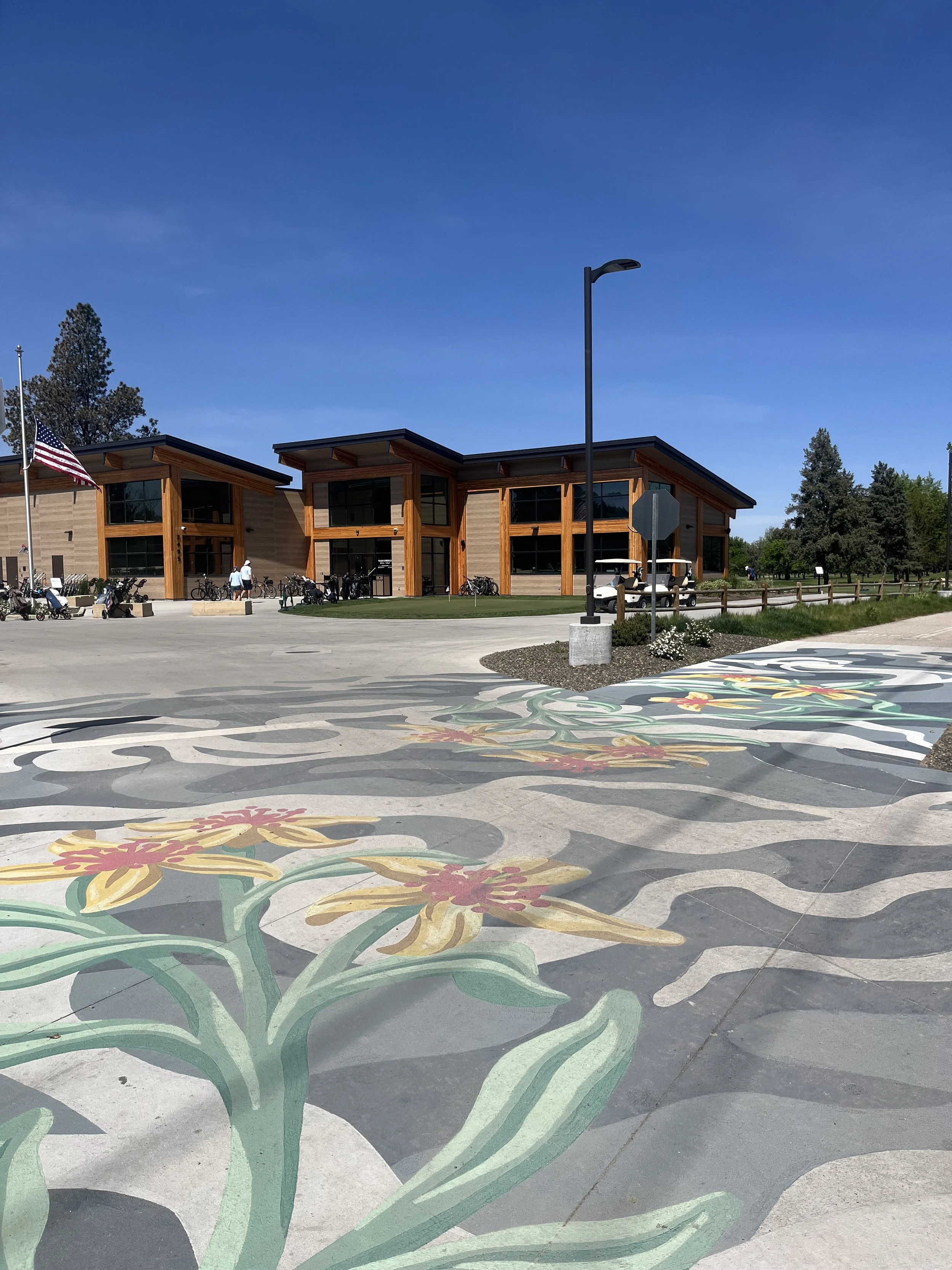
Warm Springs Golf Course is one of the oldest courses in the Treasure Valley. As the course prepared for a new chapter, the existing identity needed to evolve to reflect the quality of the experience on the ground while elevating and building a stronger, more cohesive brand system that could flex across two distinct sub-brands: the golf course itself and the Warm Springs Grill + Golf restaurant.
The primary goal was honor a beloved local institution while introducing a visual identity with enough sophistication and structure to carry the brand into its next era.

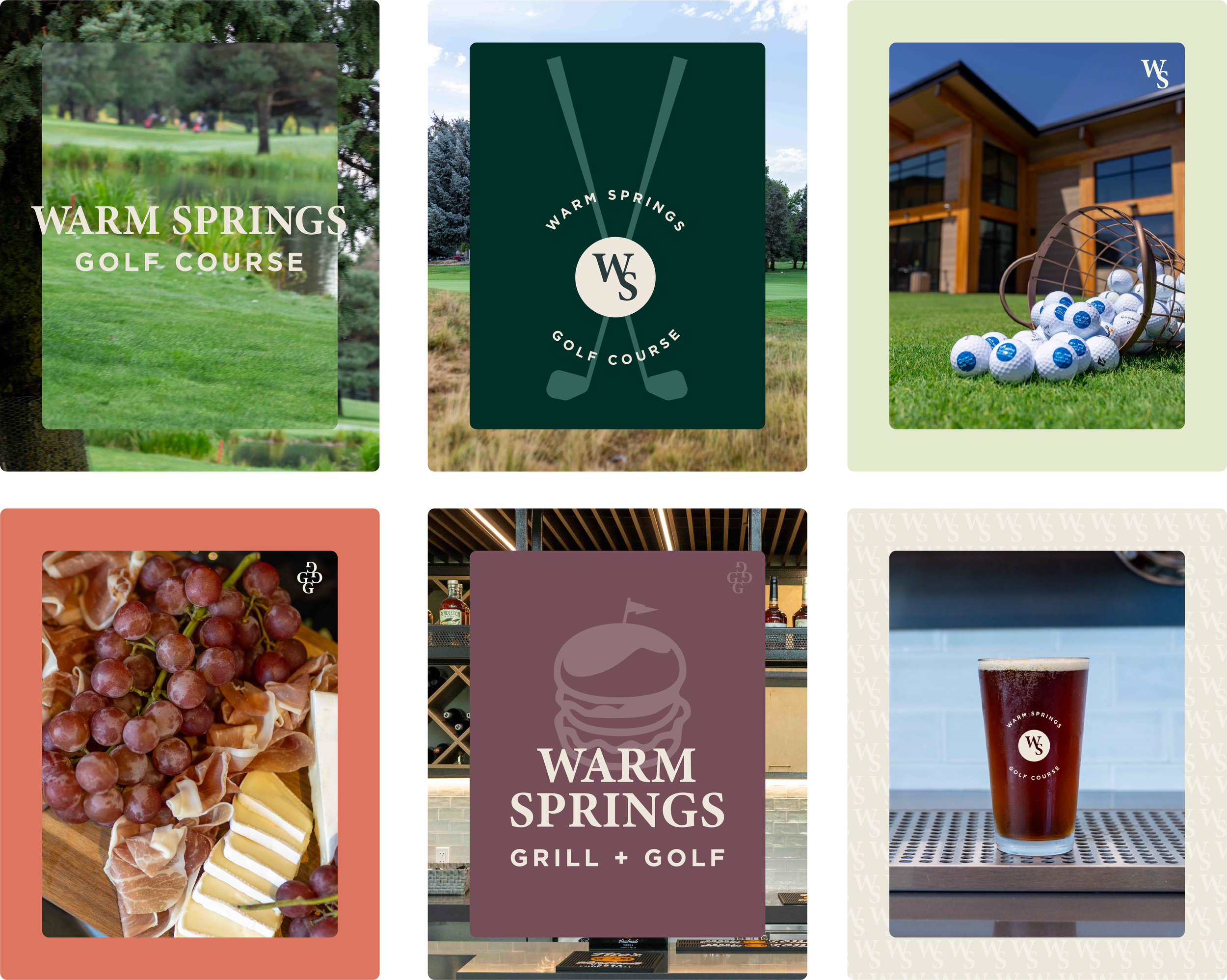
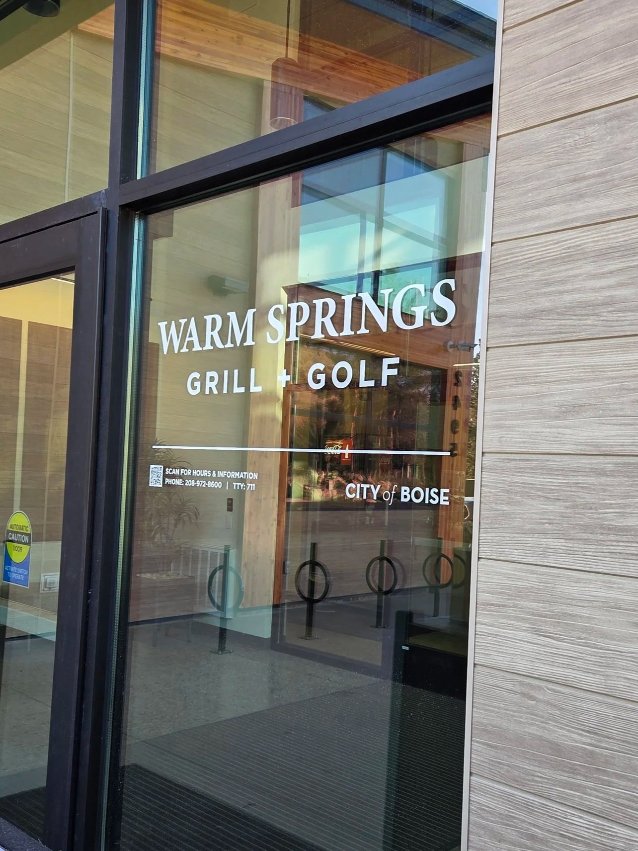
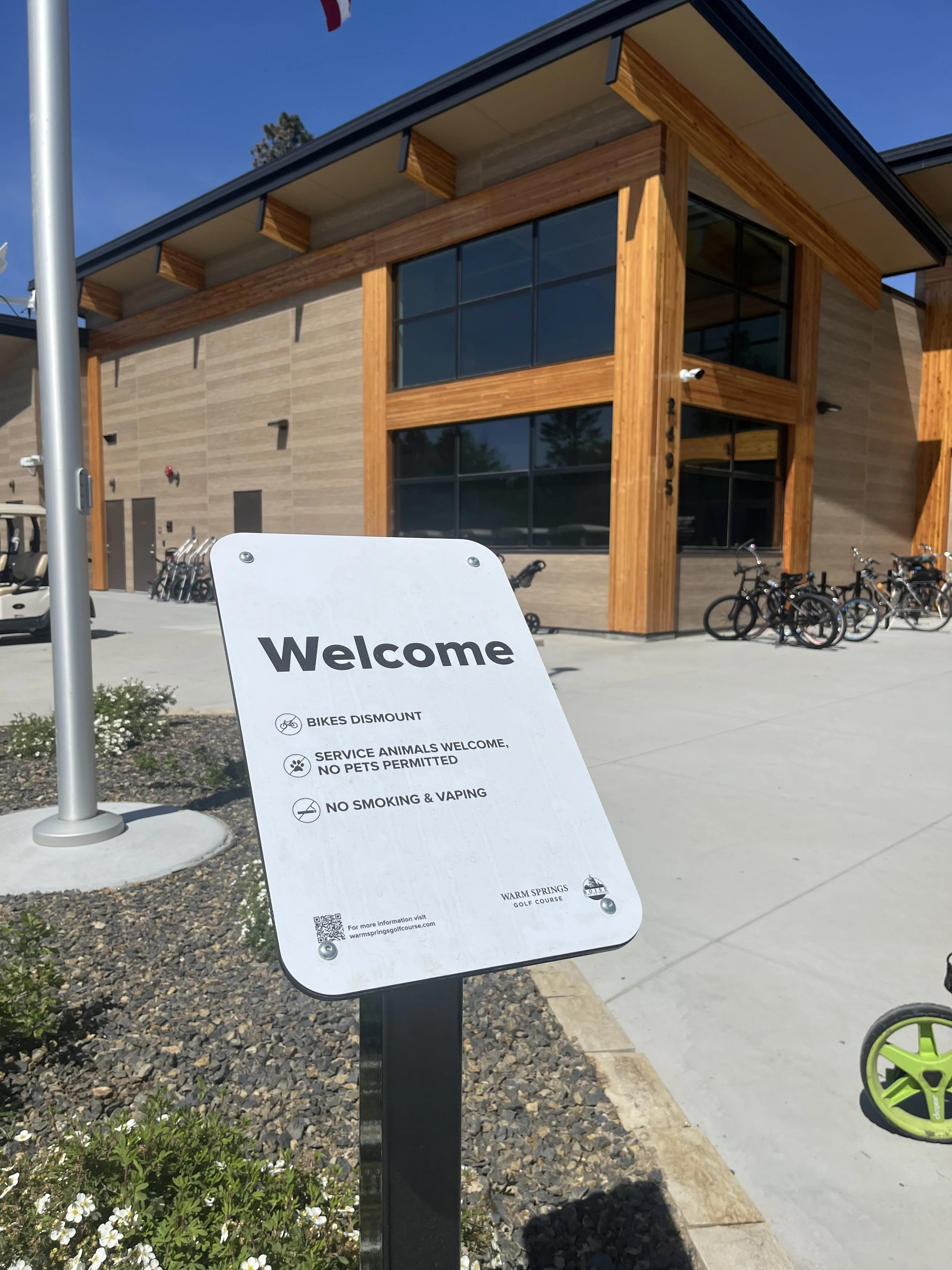
A family of logo marks was developed to serve both Warm Springs Golf Course and Warm Springs Grill + Golf, with horizontal, stacked, and compact favicon variants for each. The illustrative mountain and water mark — a nod to the course's natural setting along the Boise foothills — anchors the primary logo, while wordmark-only versions provide flexibility for partnership lockups and co-branded applications. City of Boise seal integrations acknowledge the course's civic identity without compromising visual clarity.


Typography
Two typefaces define the brand's voice. Minion Bold is a serif rooted in Renaissance-era letterforms — its optical proportions and bracketed serifs carry a sense of history and craft that mirrors the course's standing as one of Boise's oldest and most storied public amenities. It lends the brand a quiet authority without feeling stiff or exclusive.
Gotham Bold provides the counterbalance. Geometric, confident, and highly legible at any size, it handles the functional work of the brand — signage, apparel wordmarks, wayfinding, and UI — with clean efficiency. Where Minion brings warmth and heritage, Gotham brings precision and modern clarity.
Together, the pairing avoids the trap of feeling either too stuffy or too casual. It's a system that can dress up for a club tournament and still feel at home on a Saturday morning tee time — fitting for a course that has always belonged to everyone.


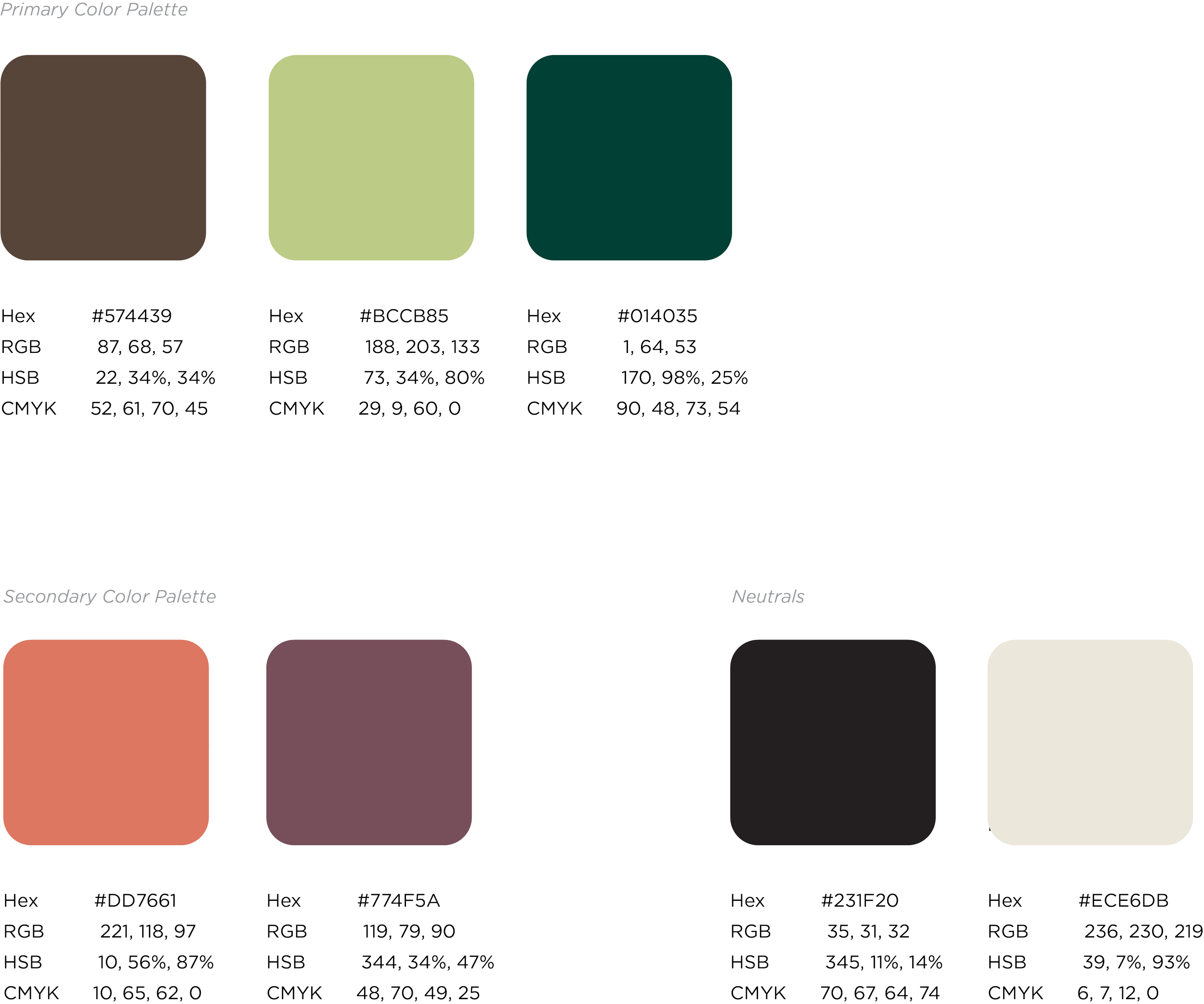
Color
A two-tier palette is rooted in deep, earthy greens and warm browns that reflect the natural landscape of the course and the Treasure Valley. A secondary palette introduces muted rose and terracotta tones to support the Grill + Golf sub-brand, adding warmth suited to a hospitality context. A soft warm neutral ties the system together across backgrounds and materials, giving both brands a shared foundation while allowing each to carry its own personality.

Brand System
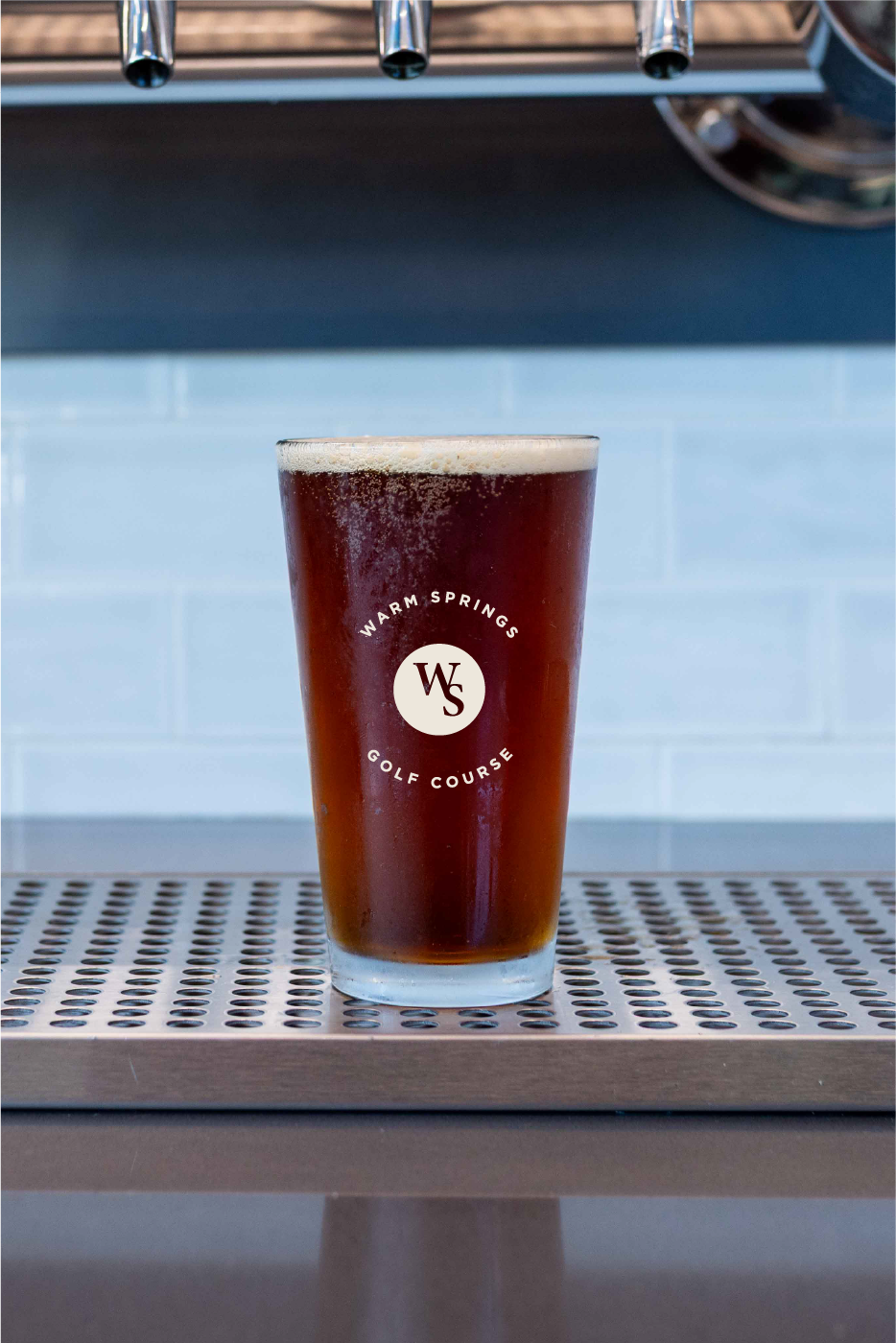
A comprehensive brand guide was produced documenting logo usage, color specifications across CMYK, RGB, and Hex, typography hierarchy, favicon system, pattern applications, and merchandise guidelines. The system gives staff and vendors a shared foundation for producing consistent materials — from pint glasses and golf balls to scorecards and co-branded City of Boise lockups.

Goals
Establish a unified visual identity across the golf course and Grill + Golf sub-brand
Build a structured, documented brand system to support consistent application
Honor the course's community heritage while introducing a more refined, contemporary expression
Create a flexible logo family that performs across scale, color, and context
Outcome & Impact
The updated brand gives Warm Springs Golf Course a cohesive identity built to grow with the institution — one that performs equally well on a scorecard, a hat brim, and a pint glass. The documented system reduces inconsistency over time and equips the City of Boise team with the tools to maintain brand integrity across vendors and departments.
This project was a reminder that great public amenities deserve great brands — and that strong systems thinking is what makes a brand durable, not just good-looking on day one.
Project Scope
Brand identity development and visual system
Logo family and favicon development
Color palette definition across print and digital
Typography system
Merchandise and swag application design
Brand guide production
Project Involvement
Led all visual direction across logo, color, typography, pattern, and brand applications
Developed a flexible logo family for two distinct but related sub-brands
Designed and produced a comprehensive brand guide for ongoing use by City of Boise staff and vendors