
Boise Public Library!
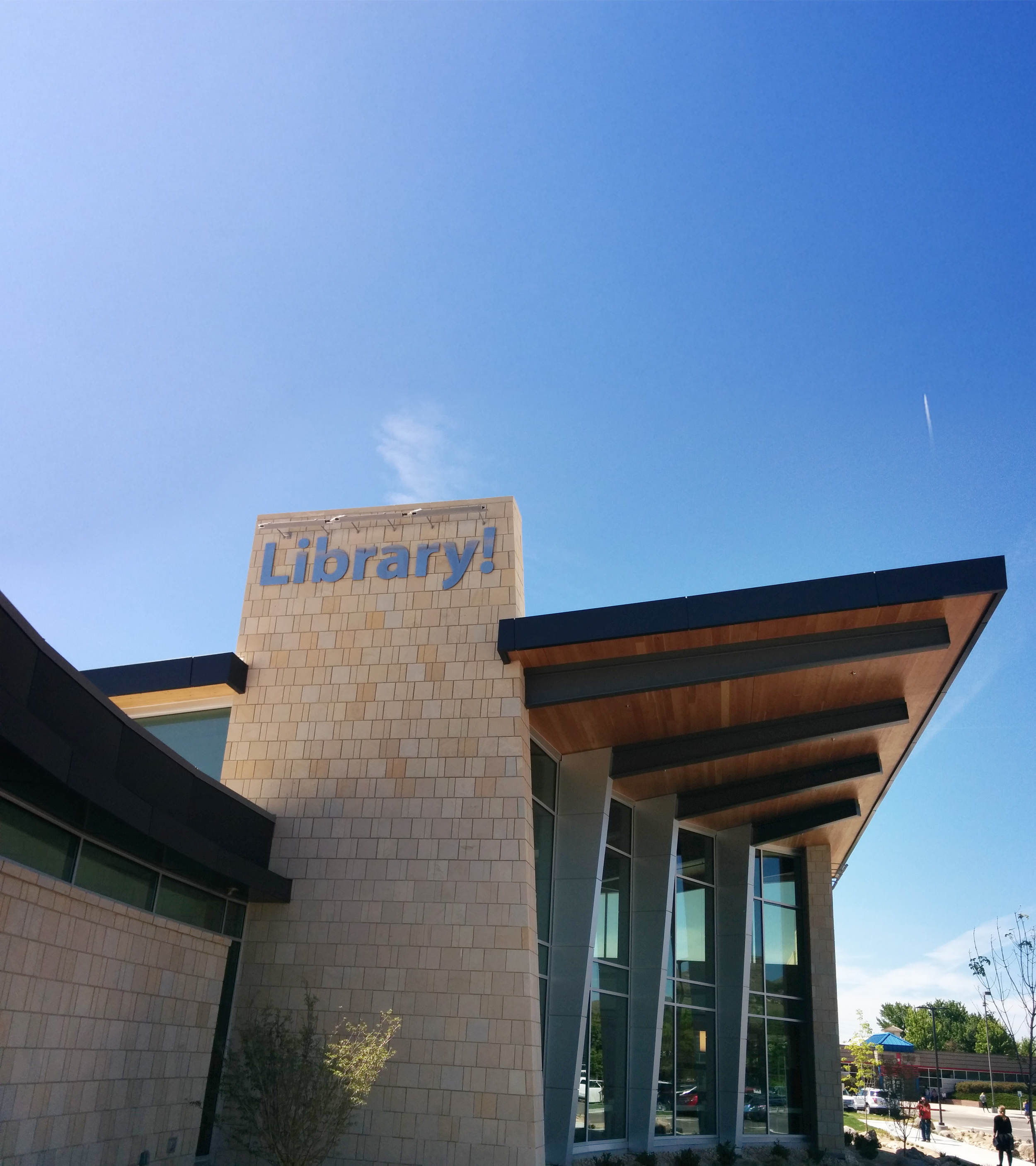
The Boise Public Library, known by the community as the "Library!", began a series of construction and renovation projects to modernize and update library locations across the Treasure Valley. While the Library holds strong brand equity and did not require a full rebrand, the renovations created an opportunity to refresh and refine the existing identity.
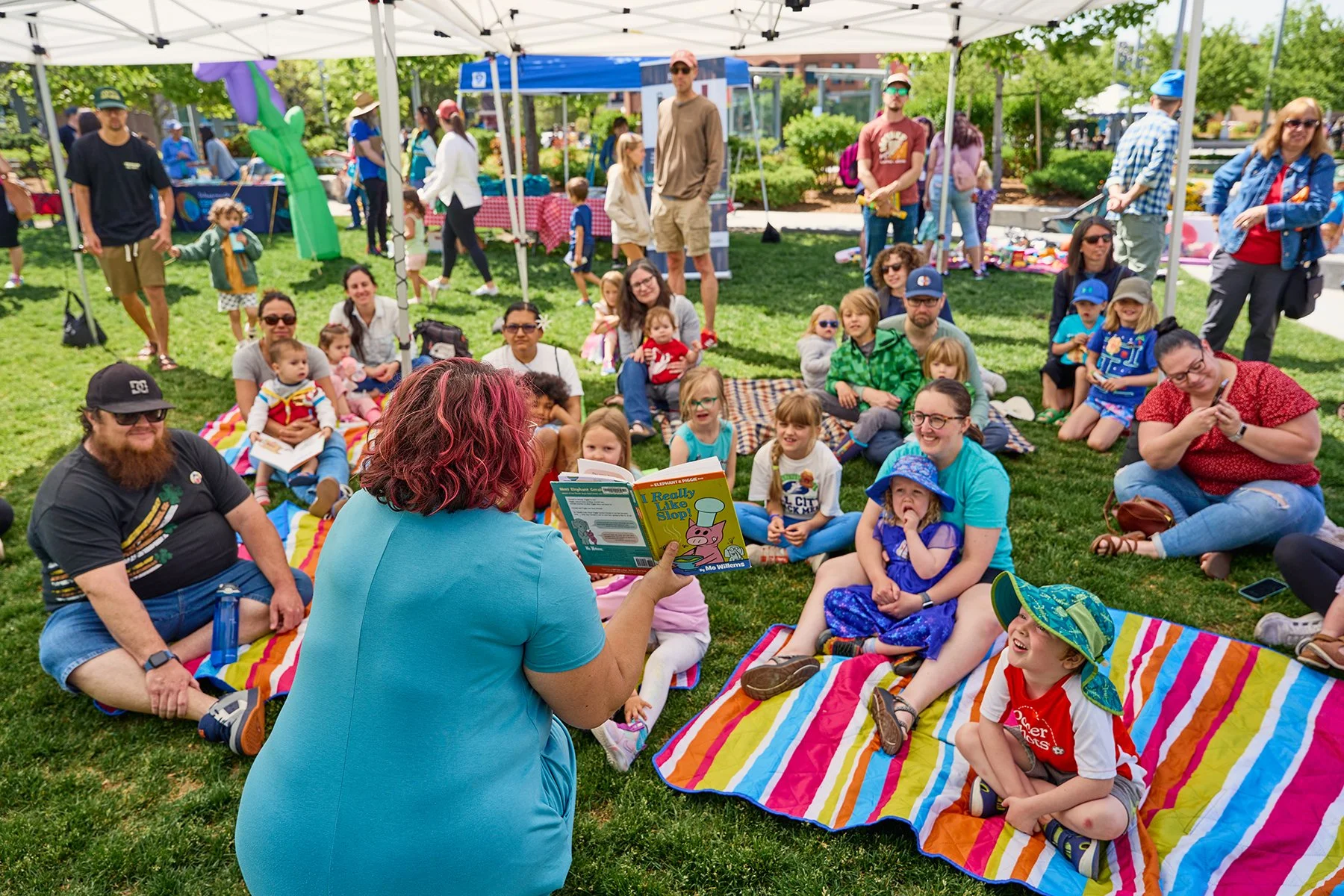
The heart of this rebrand are the humans of Boise in all their differences, needs and beauty. The updated brand needed to address accessibility through a more dynamic color palette, and establish a clearer, more structured brand system.
The goal was to maintain a refined, recognizable identity that feels welcoming and contemporary, captures a sense of youth, and resonates with the natural and organic architectural decisions introduced through the renovations.


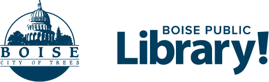
NEW
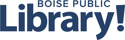
OLDLogo
Problem The previous logo — "Library!" contained within a thought bubble — created balance issues due to the descending bubbles. This made lockups challenging and often introduced awkward gaps within layouts and partnership lineups.
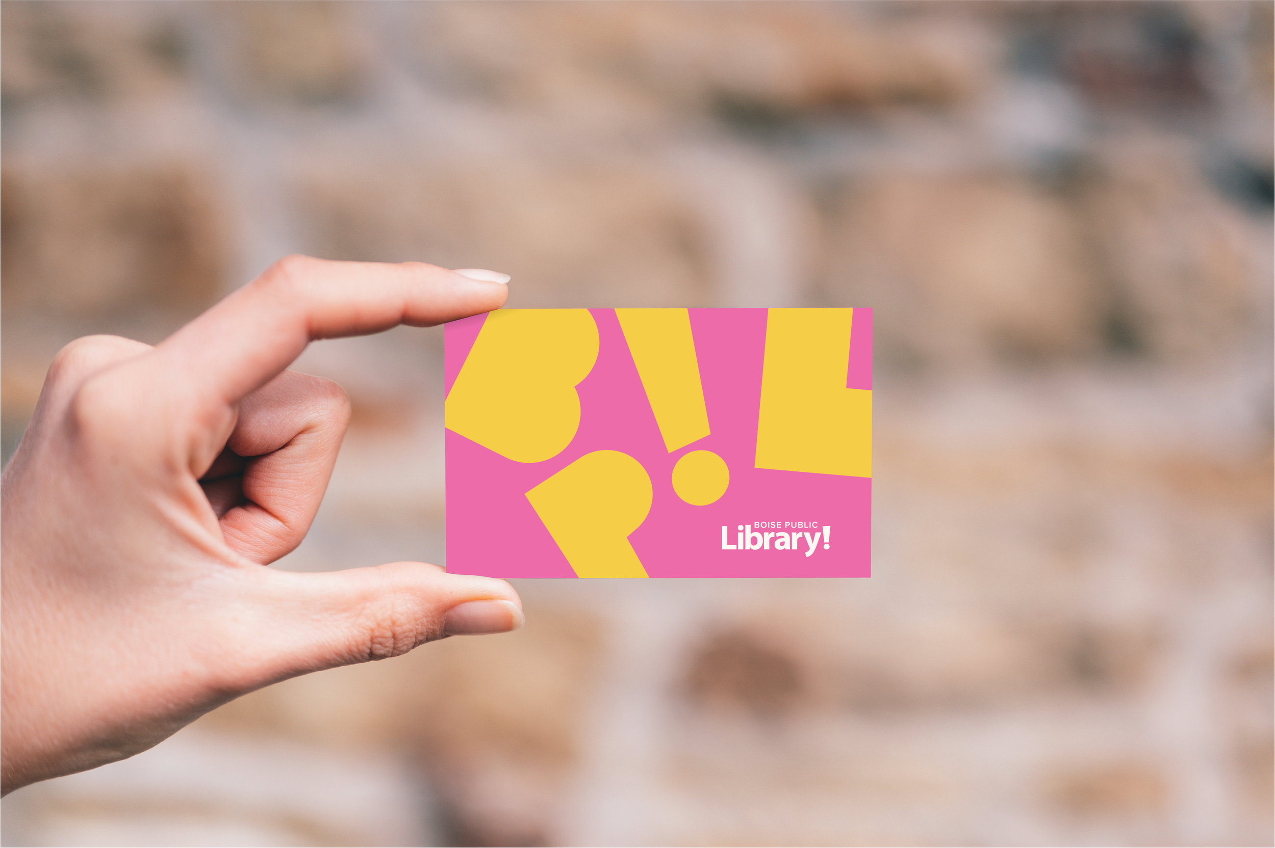
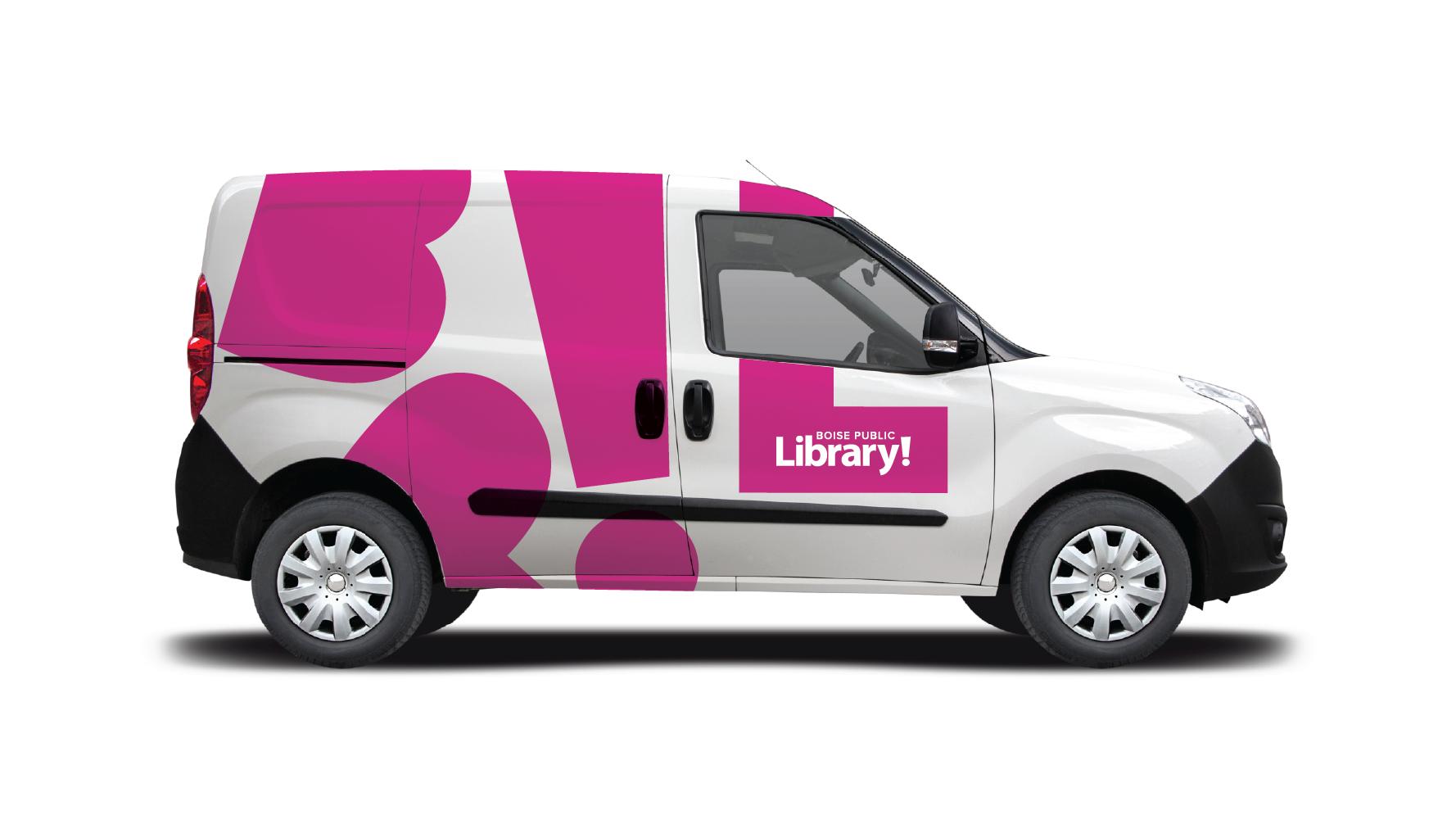
Solution Since 1995, the exclamation point has been a recognizable and distinctive element of the Library's identity. To preserve this association and equity, the thought bubble was removed while retaining the wordmark and exclamation point. This refinement allows the logo to scale more effectively, simplifies lockups, and improves alignment with partner logos — supporting clearer, more flexible use across marketing and communication materials.
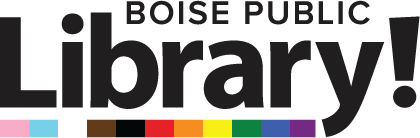
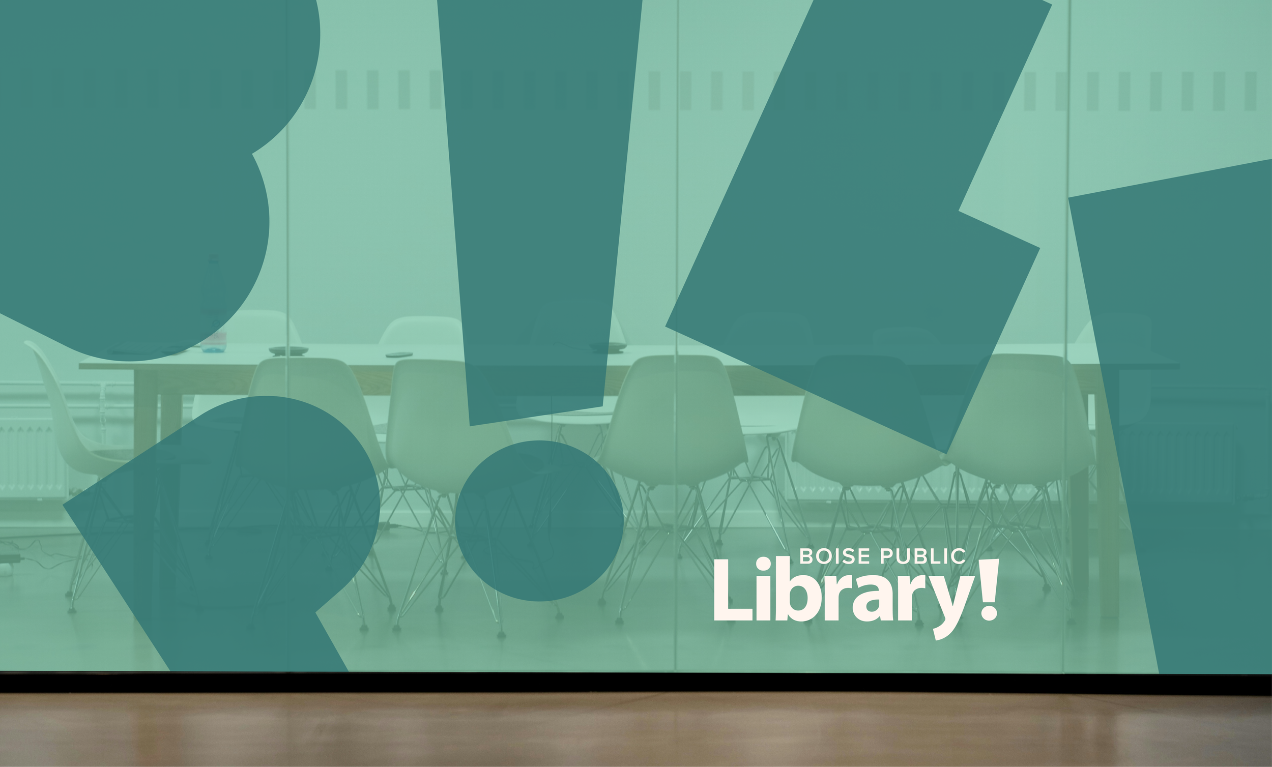
A defining feature of the refreshed brand is this beloved exclamation mark. It expresses pride, enthusiasm, and the importance of the Library's role in service to the community. The mark reflects the Library's responsibility to be accessible, inclusive, and responsive to residents of all ages and abilities, while supporting a shared vision of imagination, connection, learning, and curiosity.


Problem Over time, a variety of fonts were adopted by staff and partner organizations to accommodate one-off programs and events, gradually pulling the brand in inconsistent directions.
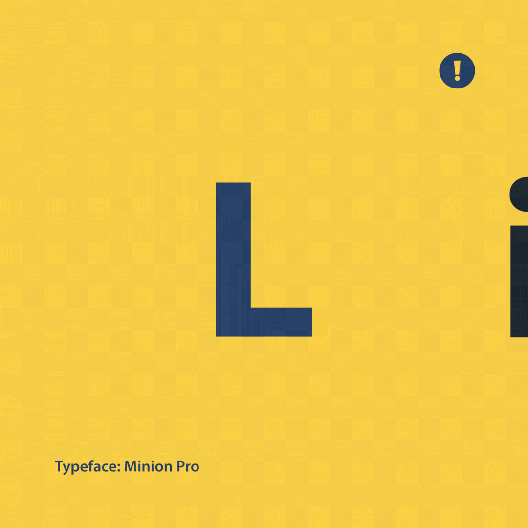
Solution Myriad Pro was selected as the primary typeface. Its letterforms are not perfectly geometric — subtle variation in character width and weight gives it an approachable, unserious quality that suits a public institution welcoming people of all ages and backgrounds, while remaining clean and professional enough to work across every application. As a font widely available across operating systems, it also supports practical, day-to-day use across the Library's staff and locations. Arial serves as the secondary typeface for Word and PowerPoint templates, ensuring accessibility without requiring special licensing or installation.
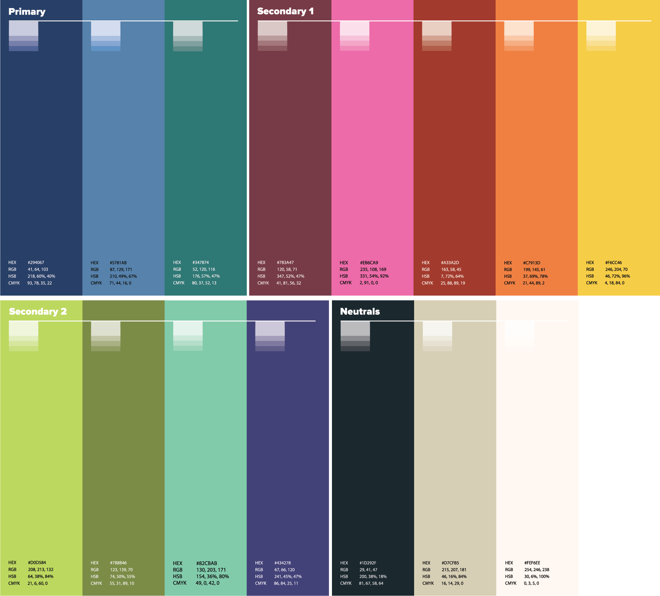
Color
Problem The previous color palette lacked sufficient contrast and dynamic range. Many colors became redundant when tints and tones were applied and, in many use cases, failed to meet accessibility contrast standards. The high saturation of the palette also made it difficult to create consistent, repeatable styles.
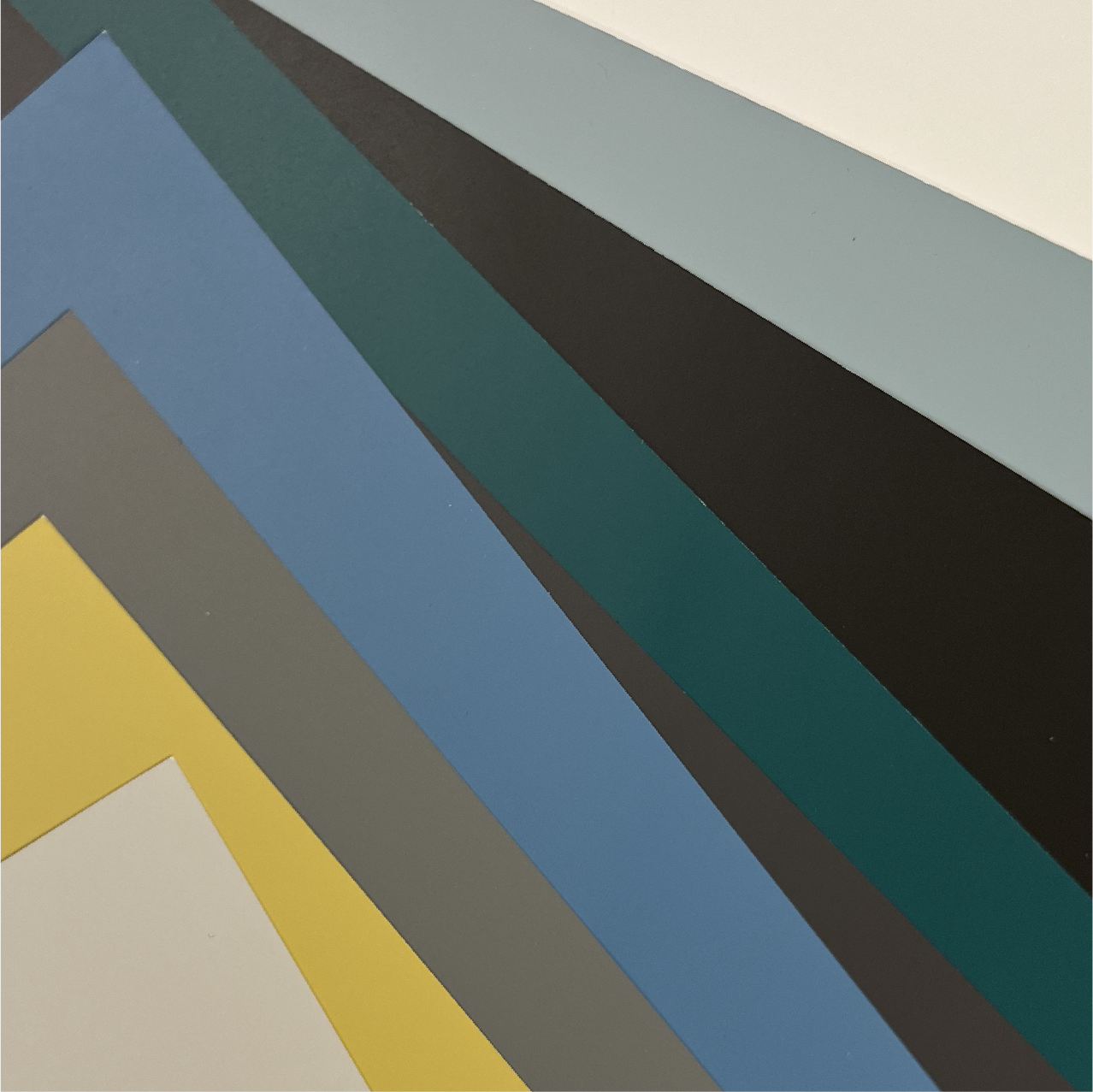
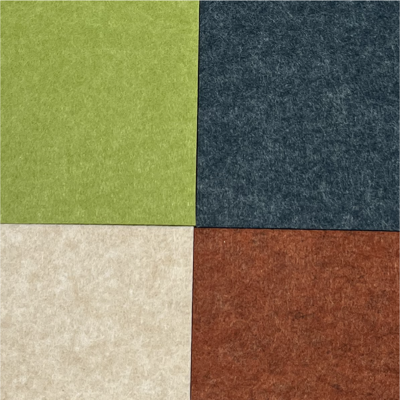
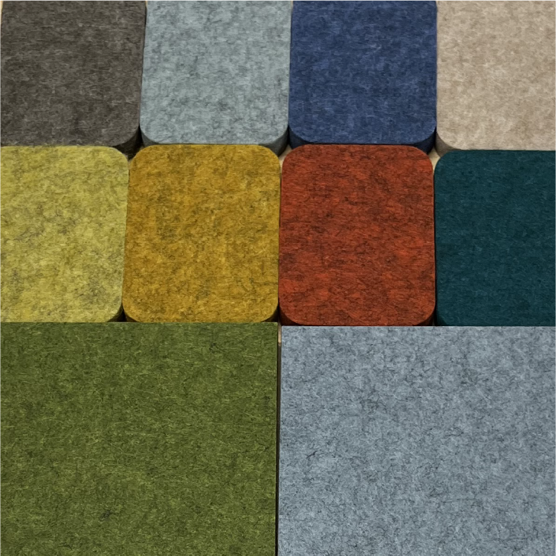
Solution To address contrast and accessibility challenges with the previous colors, the palette was rebuilt using the Library's paint and acoustic panel colors as a foundation as well as adjusting using tones and hues to ensure sufficient contrast to improve hierarchy and accessibility. Through this process, the team utilized a WCAG compliance checker (https://webaim.org/resources/contrastchecker). The resulting palette supports a better functional range while performing more effectively across print, digital, and environmental applications.
The updated palette is more dynamic and expansive, drawing inspiration from the natural environment that shapes life in Boise — the river, foothills, desert, mountains, and wildflowers. These changes reflect the Library's connection to its natural places while maintaining a youthful and playful spirit.

Brand System
Problem The brand system lacked sufficient structure, resulting in inconsistencies and a weakened sense of identity. Many materials were not easily repeatable and did not consistently reflect the Library's human-centered, service-oriented mission.
Solution A more structured brand system was introduced that balances flexibility with consistency. Clear guidelines, repeatable design components, and a refined visual framework ensure materials are cohesive, scalable, and consistently communicate the Library's people-first values across all touchpoints.


Goals
Align the brand identity with recent renovations and building updates
Resolve a dated, fragmented identity created through past workarounds and compromises
Establish a more efficient, structured brand system with a refined visual expression
Outcome & Impact
The refreshed brand system provides the Boise Public Library with a more cohesive, accessible, and adaptable identity. Improved structure and clarity make the system easier to apply across departments and partners, while the refined visual language better aligns with the renovated spaces. The result is a brand that feels contemporary and welcoming, supports long-term use, and reinforces the Library's role as a human-centered public service.
This project reinforced the importance of systems thinking in public-sector branding — prioritizing accessibility, repeatability, and longevity over trend-driven solutions while respecting the equity of an established community institution.
Team
Aaron Snethen, Art Director
Sam Fischer, Graphic Designer
Jessica Dorr, Boise Public Library Director
Emily Johnson, Boise Public Library COO
Cushing Terrell, Architecture
Project Scope
Brand system refinement and visual identity update
Logo evolution and usage guidelines
Color palette development and accessibility compliance
Application design across print, digital, and environmental touchpoints
Project Involvement
Led visual direction across logo, color, typography, and brand applications
Consulted with Library leadership and stakeholders to align identity with mission and renovated spaces
Designed an accessible brand system balancing community inclusivity and institutional equity
Coordinated guidelines and templates to ensure consistent output across departments and partners